url <- "https://www.dropbox.com/scl/fi/3z0phw1h42va1t79wm3e5/data_b1700_01.csv?rlkey=z612clpohrx3gwknavbo0cakb&dl=1"
df <- read.csv(url)
df <- df[1:250,] # this reduces the dataset to its first 250 rows
rm(url)14 Data Visualisation (3.1)
14.1 Learning Outcomes
By the end of this tutorial, you should:
- be able to produce basic plots using the ggplot2 package
- understand the basic types of visualisations commonly used in data analysis
- understand the concept of layers within ggplot2
There is a really useful guide to creating graphs in R here and an excellent overview of ggplot2, with lots of examples here.
14.2 Reading
Before this tutorial you should access and review the following papers:
Li, Yongjun, Lizheng Wang, and Feng Li. ‘A Data-Driven Prediction Approach for Sports Team Performance and Its Application to National Basketball Association’. Omega 98 (1 January 2021): 102123. [1]
Loo, Joanne Kyra, John William Francis, and Michael Bateman. ‘Athletes’ and Coaches’ Perspectives of Performance Analysis in Women’s Sports in Singapore’. International Journal of Performance Analysis in Sport 20, no. 6 (1 November 2020): 960–81. [2]
Stein, Manuel, Halldór Janetzko, Daniel Seebacher, Alexander Jäger, Manuel Nagel, Jürgen Hölsch, Sven Kosub, Tobias Schreck, Daniel A. Keim, and Michael Grossniklaus. ‘How to Make Sense of Team Sport Data: From Acquisition to Data Modeling and Research Aspects’. Data 2, no. 1 (2017): 2. [3]
There are direct links to these papers via the library reading list.
14.3 Dataset
For this tutorial you should have access to the dataset data_b1700_01.csv, which can be downloaded from myplace.
14.4 Introduction to ggplot2
‘ggplot2’ is a powerful and flexible data visualization package in R. It’s built on the principles of the “Grammar for Graphics”, a systematic approach to create complex and customizable graphics from simple components.
A ggplot2 graphic is created by adding layers to a base plot. The base plot is created using the ‘ggplot()’ function, and additional layers, such as geometries, scales, and themes, are added using the ‘+’ operator.
Here is the basic structure of a ggplot2 plot:
library(ggplot2)
# first, we create the plot in the first line
# then we add more layers
# to create the final visualisation

    ggplot(data = data, mapping = aes(x = x_variable, y = y_variable)) +
     geom_<type>(...) +
     scale_<type>(...) +
     theme_<type>(...)
14.5 Creating basic plots in ggplot2
14.5.1 A simple scatter plot
To create a scatter plot, we use the ‘geom_point()’ geometry:
# Load required packages
library(tidyverse)
── Attaching core tidyverse packages ──────────────────────── tidyverse 2.0.0 ──
✔ dplyr 1.1.3 ✔ readr 2.1.4
✔ forcats 1.0.0 ✔ stringr 1.5.0
✔ ggplot2 3.4.4 ✔ tibble 3.2.1
✔ lubridate 1.9.3 ✔ tidyr 1.3.0
✔ purrr 1.0.2
── Conflicts ────────────────────────────────────────── tidyverse_conflicts() ──
✖ dplyr::filter() masks stats::filter()
✖ dplyr::lag() masks stats::lag()
ℹ Use the conflicted package (<http://conflicted.r-lib.org/>) to force all conflicts to become errorslibrary(ggplot2)
# Scatter plot
scatter_plot <- ggplot(df, aes(x = height, y = personal_best)) +
geom_point()
scatter_plot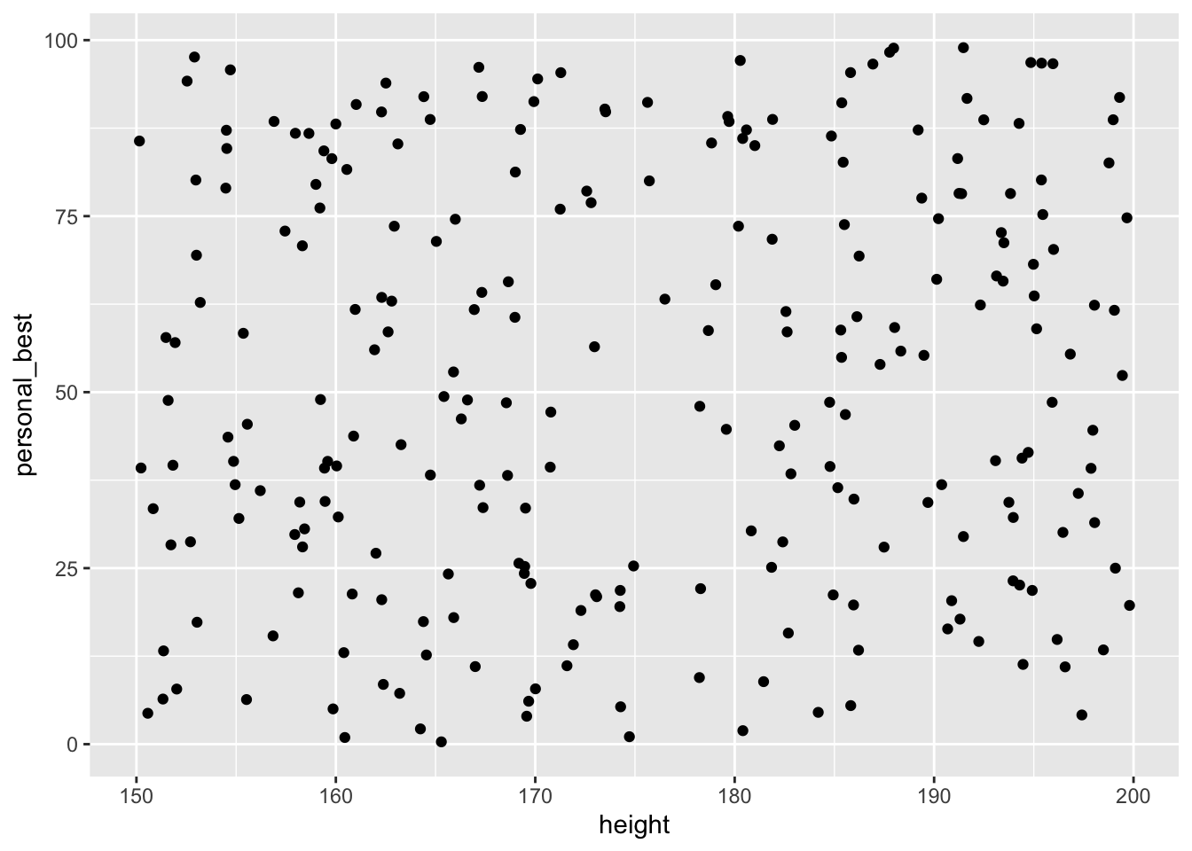
14.5.2 Creating a line graph
To create a line graph, we simply replace the command ‘geom_point’ with ‘geom_line()’.
# Line plot
line_plot <- ggplot(df, aes(x = height, y = personal_best)) +
geom_line()
line_plot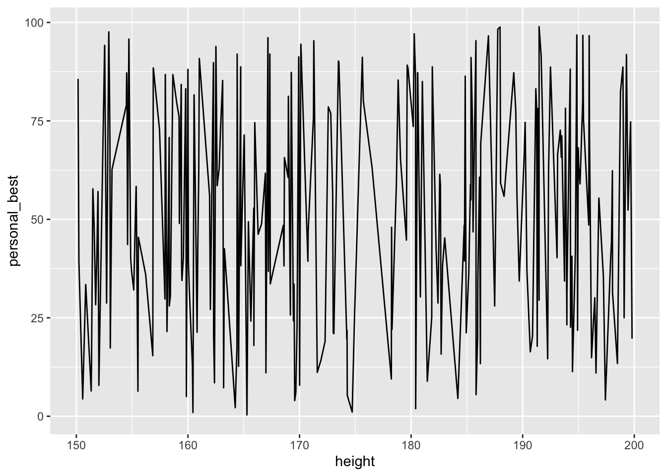
14.5.3 Creating bar plots and histograms
We may wish to plot frequencies for a single variable, or bar plots by grouping variable.
For a bar plot, we can use ‘geom_bar()’
for a histogram use ‘geom_histogram()’:
histo_plot <- ggplot(df, aes(x = height)) +
geom_histogram()
histo_plot
`stat_bin()` using `bins = 30`. Pick better value with `binwidth`.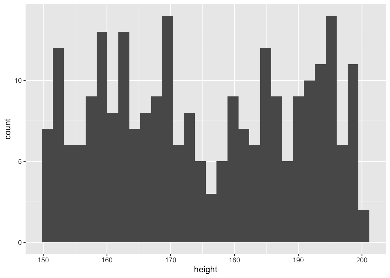
For a box plot ‘geom_boxplot()’ can be used:
plot <- ggplot(df, aes(x=factor(gender), y=personal_best))+
geom_boxplot()+
theme( legend.position = "none" )
plot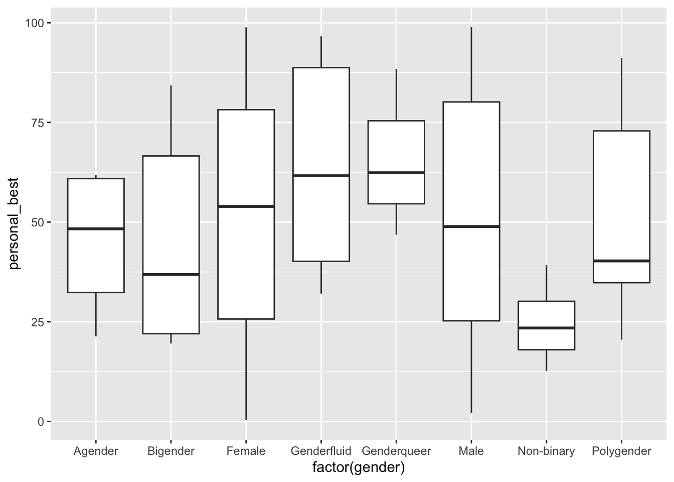
And for a violin plot use ‘geom_violin()’:
library(ggplot2)
# Basic violin plot
df$sport <-as.factor(df$sport)
p <- ggplot(df, aes(x=sport, y=height)) +
  geom_violin()
p + stat_summary(fun.y=mean, geom="point", size=2, color="red") # this adds the mean
Warning: The `fun.y` argument of `stat_summary()` is deprecated as of ggplot2 3.3.0.
ℹ Please use the `fun` argument instead.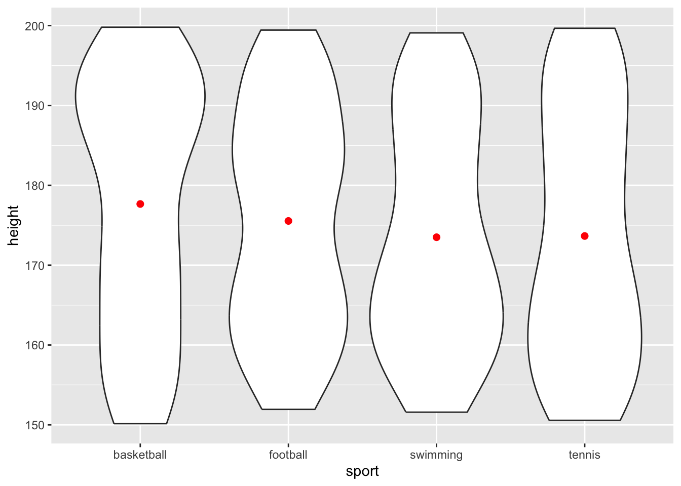
14.6 Customizing plot aesthetics (color, size, shape, etc.)
You can customize the appearance of a ggplot2 plot by adding additional layers or modifying the aesthetics. For example:
# Customized scatter plot with color and size

df_cut <-df[5:30,] # I'm creating a subset of the data for ease of visualisation

scatter_plot <- ggplot(df_cut, aes(x = personal_best, y = height, color=age, size=weight)) +
geom_point(alpha = 0.7) +
scale_color_gradient(low = "blue", high = "red") +
theme_minimal()
scatter_plot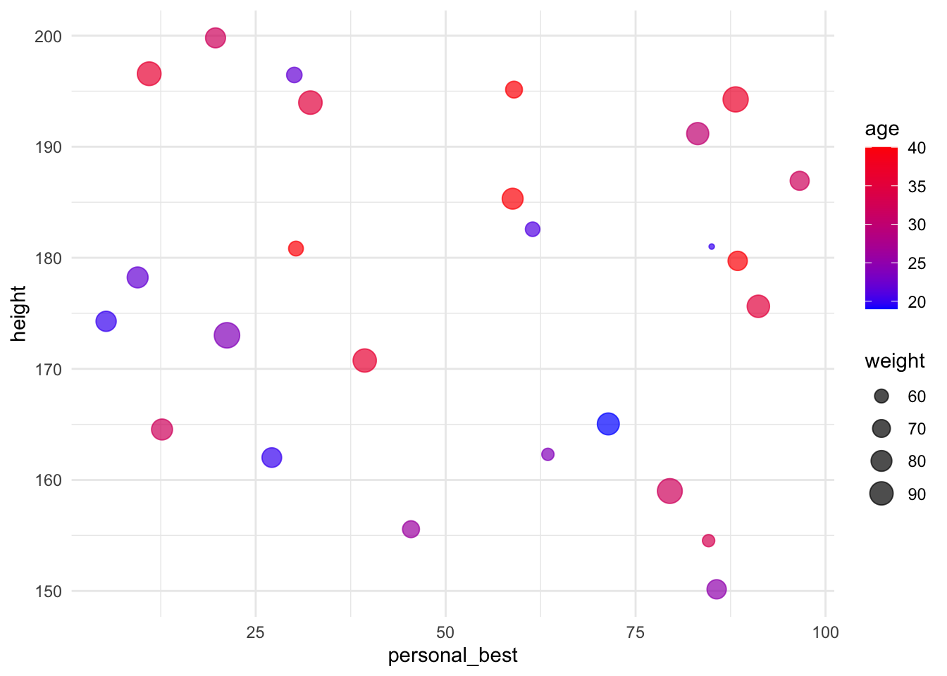
14.7 Adding layers
You can add multiple geometries to a single ggplot2 plot, making the production of complex figures fairly straightforward.
# Scatter plot with regression line
scatter_plot_with_line <- ggplot(df, aes(x = height, y = personal_best)) +
geom_point() +
geom_smooth(method = "lm", se = FALSE, color = "red") +
theme_bw()
scatter_plot_with_line
`geom_smooth()` using formula = 'y ~ x'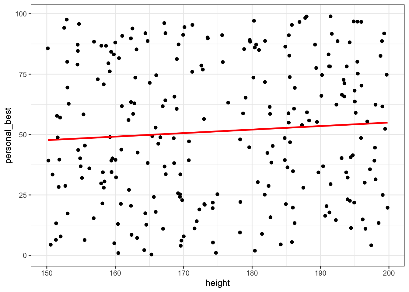
14.8 Faceting plots for multiple categories
Faceting is a powerful feature in ggplot2 that allows you to create multiple small plots based on a categorical variable within a single visualization.
This technique is useful for exploring patterns and relationships in your data across different categories or groups.
There are two main functions for faceting in ggplot2: ‘facet_wrap()’ and ‘facet_grid()’.
14.8.1 Facet Wrap
facet_wrap() creates a set of small plots arranged in a grid, where each plot represents a subset of the data based on the values of one or more categorical variables. The plots are arranged in a single row or column and then wrapped, similar to how text wraps in a paragraph.
Example: Scatter plot faceted by a single categorical variable.
# Scatter plot faceted by 'category'
scatter_plot_facet_wrap <- ggplot(df, aes(x = height, y = weight)) +
geom_point() +
facet_wrap(~sport)
scatter_plot_facet_wrap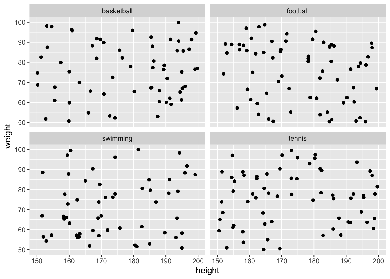
14.8.2 Facet Grid
‘facet_grid()’ creates a set of small plots arranged in a grid, where each plot represents a subset of the data based on the values of one or more categorical variables. Unlike ‘facet_wrap()’, ‘facet_grid()’ allows you to create a grid with multiple rows and columns, based on two categorical variables.
Example: Scatter plot faceted by two categorical variables.
# Scatter plot faceted by 'category1' and 'category2'
    scatter_plot_facet_grid <- ggplot(df, aes(x = height, y = personal_best)) +
     geom_point() +
     facet_grid(gender ~ sport)
    scatter_plot_facet_grid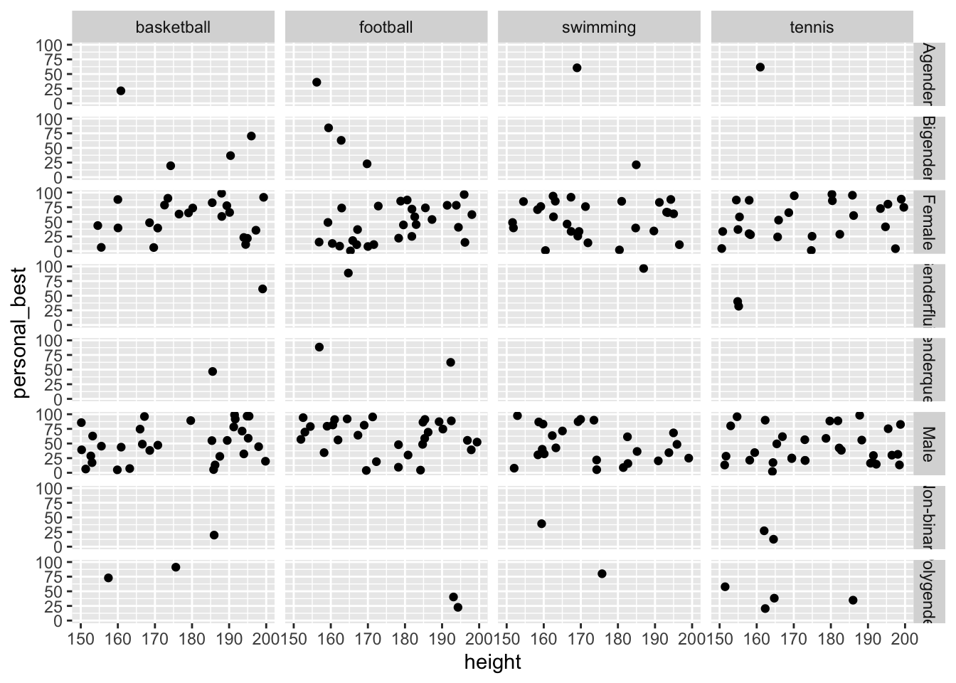
14.9 Alternative Approaches
While the ‘ggplot2’ package is enormously powerful in creating visualisations of your data, sometimes you will not require its complexity. In Tutorial 4.2 (Exploratory Data Analysis) we will identify simpler ways to produce the most common visualisations used in sport data analytics.
14.10 Activity: Creating plots using ggplot2
The following exercises are designed to encourage you to become familiar with plotting in ggplot2. They all use datasets that are available from within base R, or within the ggplot2 package.
I have provided solutions to each of these exercises. Please remember that R is a hugely flexible language and there are often lots of different ways to achieve the same outcome!
14.10.1 Basic plotting with ggplot2
- Load the dataset mtcars.
- Create a scatter plot of mpg vs. wt.
- Add a title and label the axes with meaningful labels.
Show solution
library(ggplot2)

p1 <- ggplot(mtcars, aes(x=wt, y=mpg)) +
         geom_point() +
         ggtitle("Miles per Gallon vs. Weight") +
         xlab("Weight") +
         ylab("Miles per Gallon")
print(p1)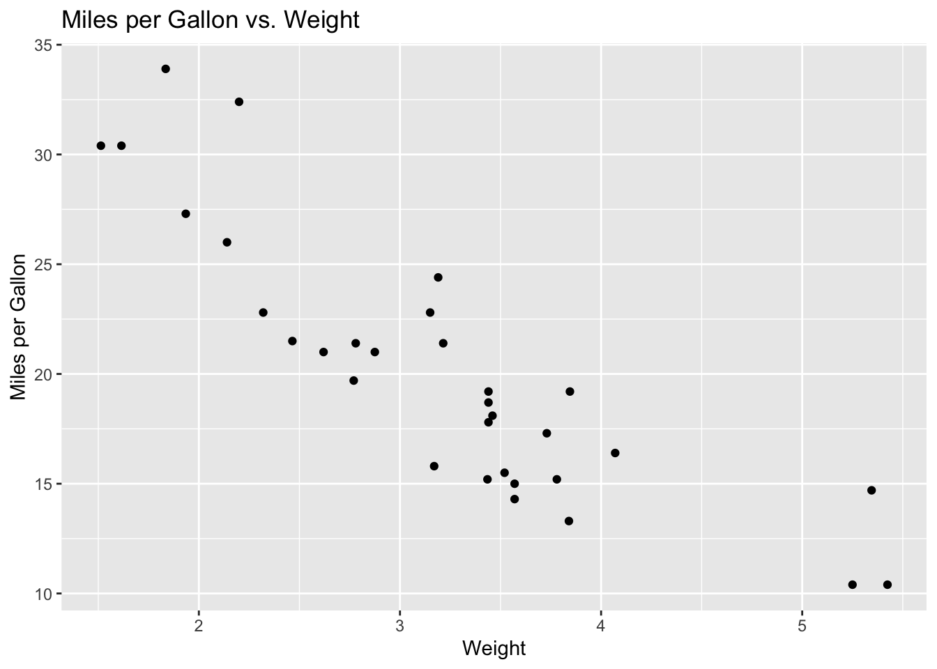
14.10.2 Layering with geoms
- Load the dataset iris.
- Using the iris dataset, create a scatter plot of Sepal.Length vs. Sepal.Width. Use different colors for each Species.
- Add a smooth line to the plot for each species.
Show solution
p2 <- ggplot(iris, aes(x=Sepal.Length, y=Sepal.Width, color=Species)) +
         geom_point() +
         geom_smooth(method='lm', se=FALSE)
print(p2)
`geom_smooth()` using formula = 'y ~ x'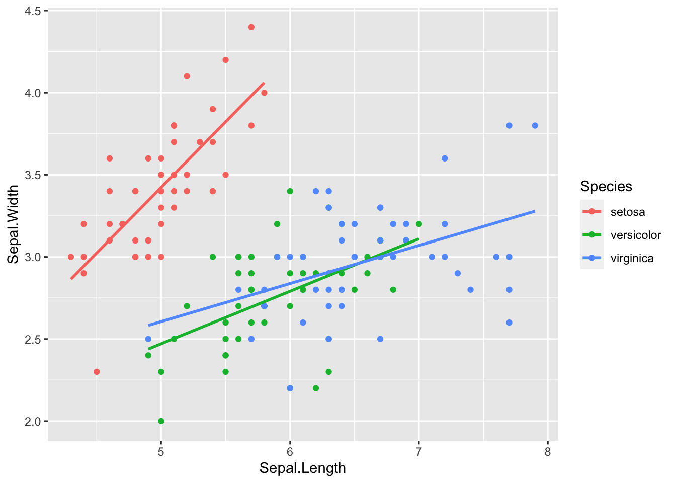
14.10.3 Faceting
- Load the diamonds dataset
- Create a scatter plot of price vs. carat. Split the data into separate plots by cut using facet_wrap().
- Adjust the scales to be ‘free’ on the y-axis.
Show solution
p3 <- ggplot(diamonds, aes(x=carat, y=price)) +
         geom_point() +
         facet_wrap(~cut, scales="free_y")
print(p3)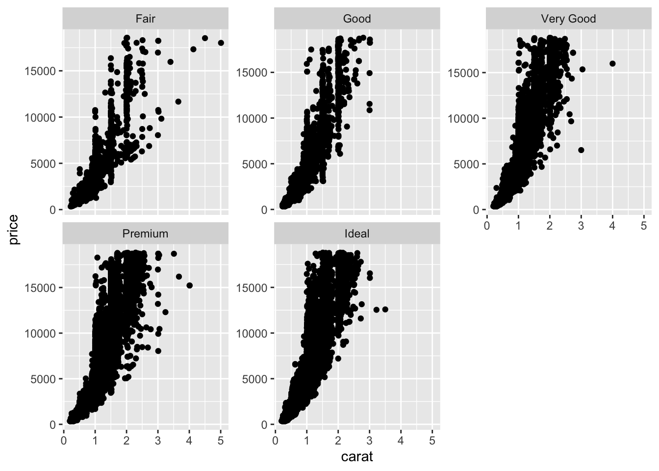
14.10.4 Theming
- Load the dataset mtcars.
- Reproduce the scatter plot from exercise 1. This time, use the theme_minimal() function to change its appearance.
Show solution
p4 <- ggplot(mtcars, aes(x=wt, y=mpg)) +
         geom_point() +
         theme_minimal()
print(p4)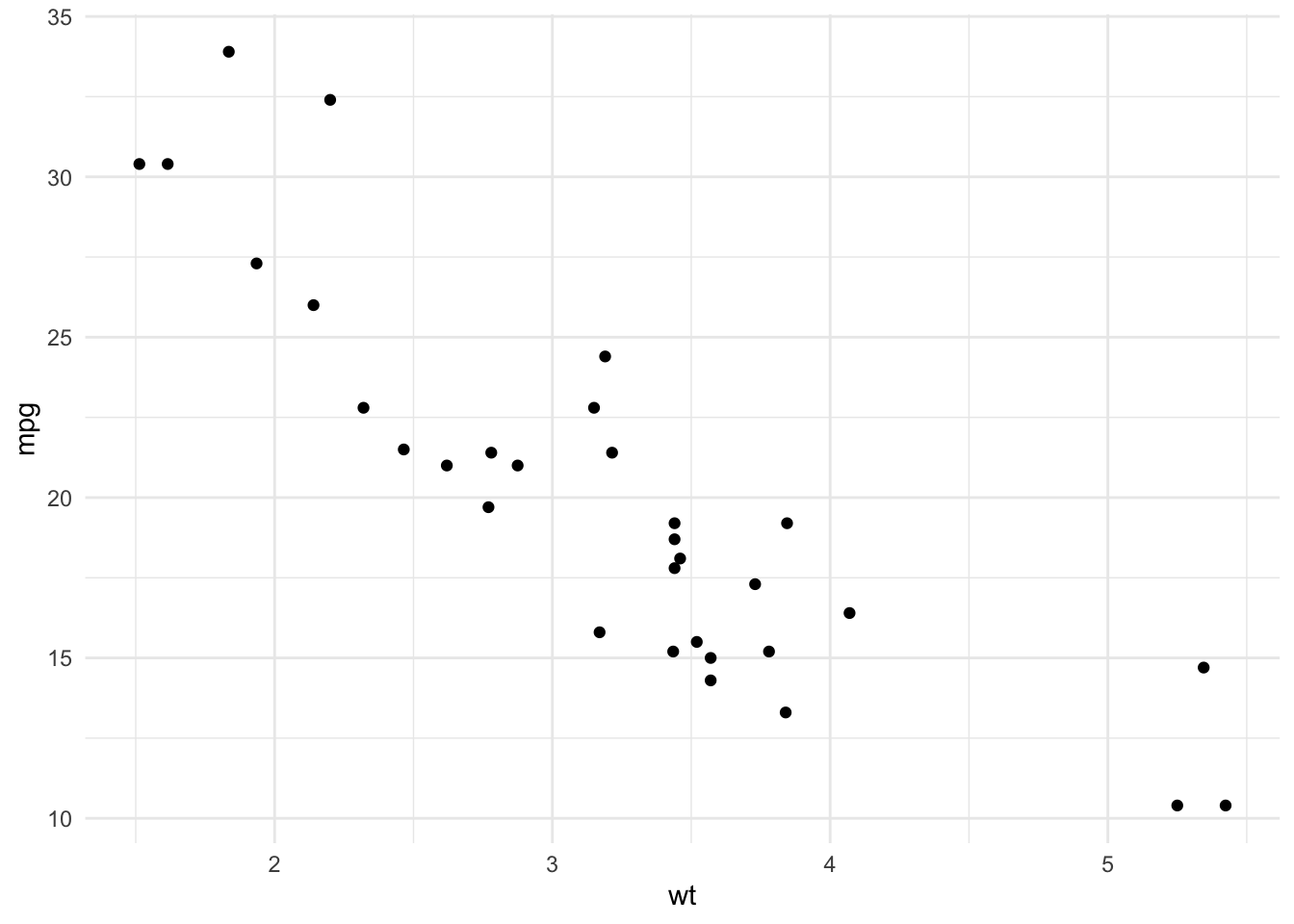
14.10.5 Bar plots and coordinate flips
- Load the dataset diamonds.
- Create a bar plot showing the number of diamonds for each cut.
- Flip the coordinates to make it a horizontal bar plot.
Show solution
p5 <- ggplot(diamonds, aes(x=cut)) +
         geom_bar() +
         coord_flip()
print(p5)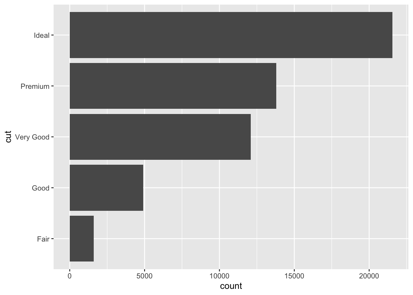
14.10.6 Histograms and binning
- Load the dataset diamonds.
- Create a histogram of diamond prices.
- Adjust the bin width to change the appearance of the histogram. Try different bin widths to see the effect.
Show solution
p6 <- ggplot(diamonds, aes(x=price)) +
         geom_histogram(binwidth=500)
print(p6)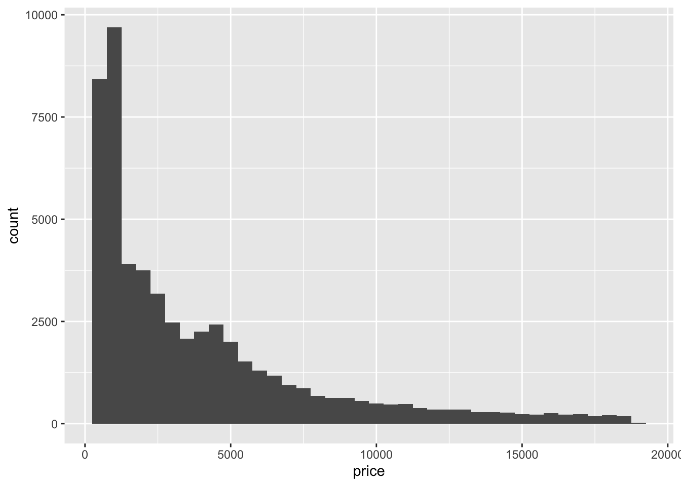
14.10.7 Boxplots and outliers
- Load the dataset iris.
- Create a box plot of Sepal.Length for each Species.
- Identify and color outliers in a different color.
Show solution
p7 <- ggplot(iris, aes(x=Species, y=Sepal.Length, color=Species)) +
         geom_boxplot(outlier.color="red")
print(p7)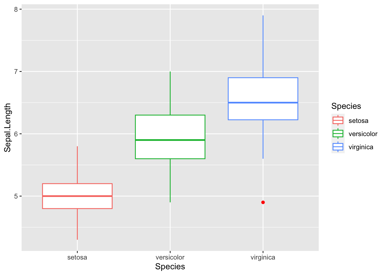
14.10.8 Position adjustments
- Load the dataset mpg.
- Create a bar plot of number of cars by class. Adjust it so the bars are stacked by drv.
- Instead of stacking, adjust the position to “dodge” so bars are side by side.
Show solution
p8 <- ggplot(mpg, aes(x=class, fill=drv)) +
         geom_bar(position="dodge")
print(p8)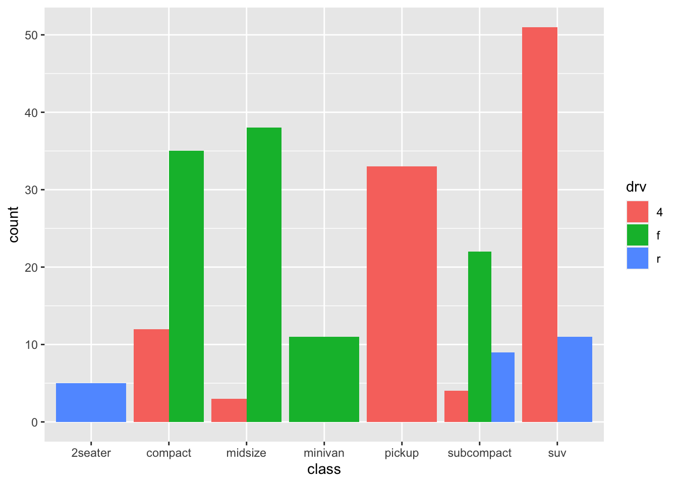
14.10.9 Customizing legends
- Load the dataset mpg.
- Create a scatter plot of hwy vs. displ and color points by class. Change the legend title to “Car Class”.
- Adjust the legend position to the bottom of the plot.
Show solution
p9 <- ggplot(mpg, aes(x=displ, y=hwy, color=class)) +
         geom_point() +
         labs(color="Car Class") +
         theme(legend.position="bottom")
print(p9)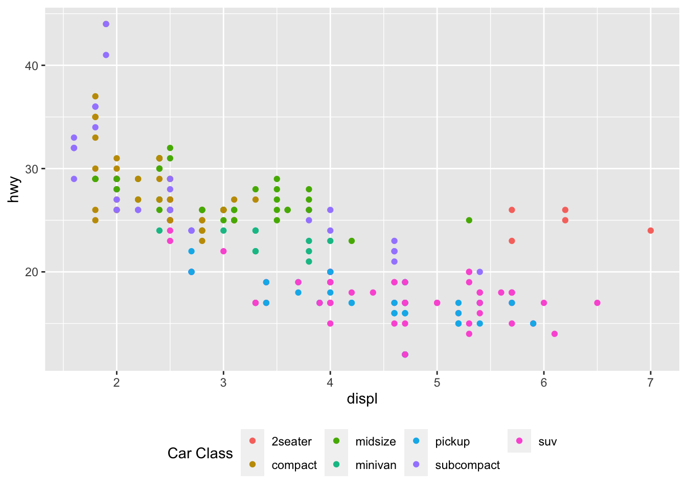
14.10.10 Saving your plots
- Save any of the previous plots to your computer with a resolution suitable for publication.
- Try different formats (e.g., PNG, PDF).
Show solution
# Save the first plot as a PNG
ggsave(filename="p1_plot.png", plot=p1, width=6, height=4, dpi=300)

# Save the first plot as a PDF
ggsave(filename="p1_plot.pdf", plot=p1, width=6, height=4)